
Research on Spectator Mode Improvement for The Finals
This study focuses on enhancing the spectator experience in private matches of the online FPS game The Finals. By analyzing current spectator features and gathering insights from player and viewer feedback, the research aims to identify pain points and suggest improvements. The goal is to optimize usability, visual clarity, and engagement for those observing matches, particularly in community tournaments or training sessions. The findings will contribute to a more polished and professional viewing experience that aligns with the fast-paced and dynamic nature of The Finals.
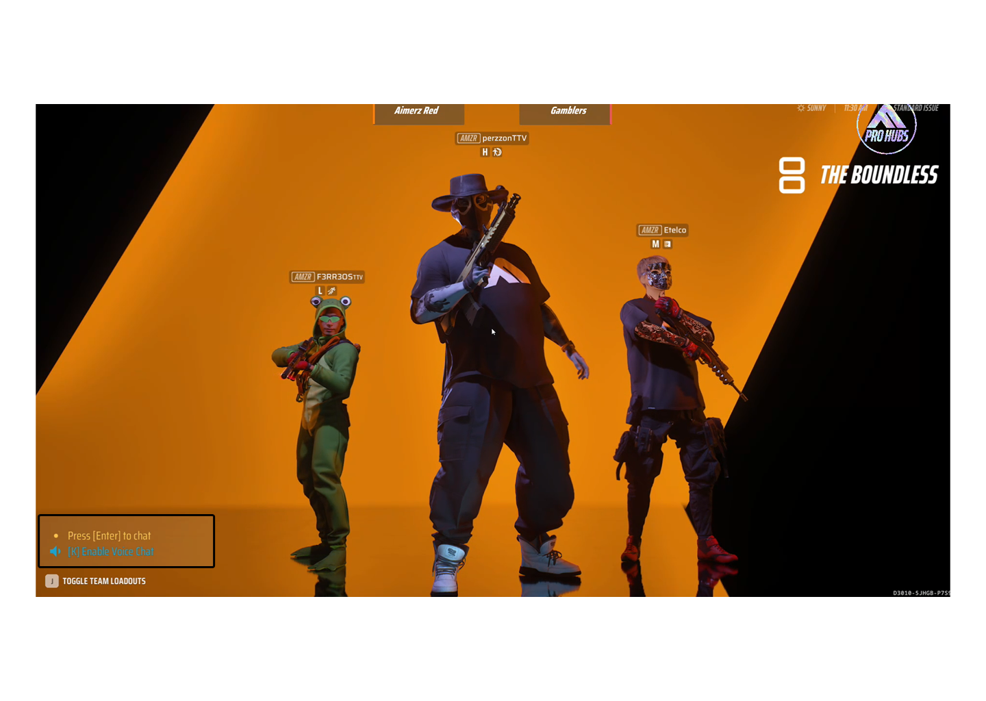
No Chat In-Game
To maintain a more polished, distraction-free, and professional viewing experience during broadcasts or community tournaments, the in-game chat feature could be disabled by default at the start of each private match. This would prevent any unmoderated or inappropriate messages from appearing on screen during live streams, and help keep the spectator interface clean and focused on gameplay. It also gives production teams better control over the content being shown, ensuring that viewers remain engaged with the action rather than being sidetracked by chat interactions.
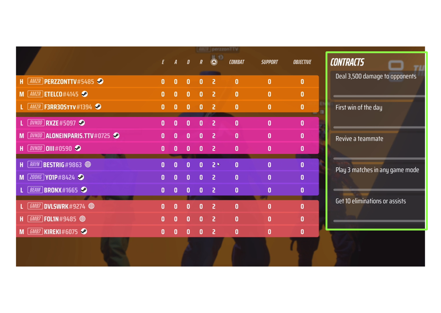
Turning Off The Tracking Contracts for Spectator
Tracking contracts, while helpful during regular gameplay, can clutter the spectator interface when viewing a match. By allowing the option to disable tracking contracts in spectator mode, the scoreboard and player overlays would appear much cleaner and easier to follow. This small change would significantly improve visual clarity, helping spectators concentrate on the match dynamics and player strategies without unnecessary distractions on the HUD.
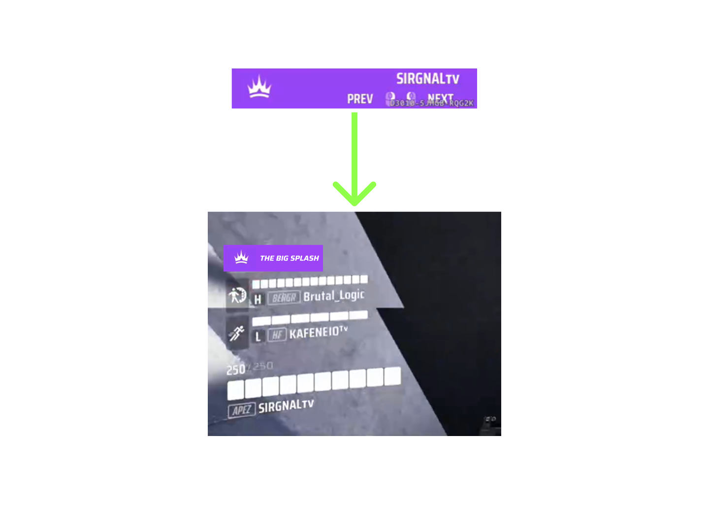
Move The Colour of the Team
Currently, team colors are displayed separately from player names, which can make it slightly harder for spectators to instantly recognize team alignment during intense gameplay. A proposed improvement is to move the team color indicator to the top of the player's name or integrate it into the name background. This would not only improve clarity but also help viewers quickly identify which players belong to which team during fast-paced situations.
In addition, this adjustment opens up valuable screen space for production teams to include sponsor logos, tournament titles, or custom messages without compromising essential player information. This is particularly useful for content creators or broadcasters looking to brand their streams while keeping the UI clean and informative.
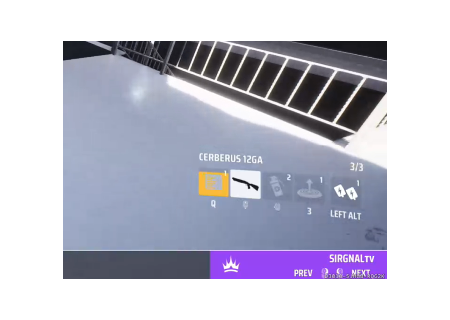
Remove The Keybind Player's Loadout
During spectating, viewers are more interested in what loadout a player is using—such as weapons, gadgets, or specializations—rather than which keys are bound to each action. Displaying keybinds can make the UI feel cluttered and less intuitive for viewers unfamiliar with a player’s personal setup. Removing or allowing the option to hide the keybind display would shift focus toward meaningful information and enhance the overall visual quality of the spectator interface, resulting in a less distracting and more immersive viewing experience.
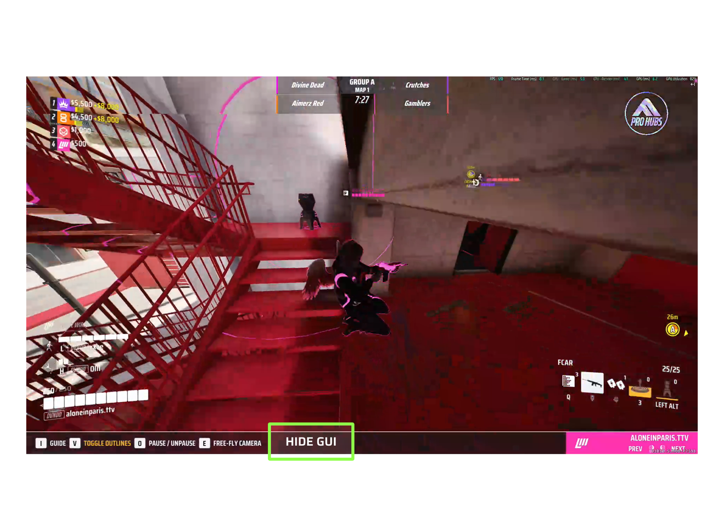
Add "HIDE GUI" Button
Introducing a “HIDE GUI” button would be a game-changer for content creators and spectators who want a cinematic or clean visual feed. This feature would allow users to hide all UI elements with a single click, making it easier to record or stream gameplay footage without any overlays. It would be especially beneficial for trailers, highlight reels, or custom content where a minimalistic, immersive look is desired. Giving control over the visibility of the interface ultimately empowers viewers and creators to tailor their experience based on their purpose—be it entertainment, analysis, or promotion.